Kathy Bui

LightHouse
A mobile app helping young adults feel safer on their walk home at night
Quick Facts
Role: UX Designer
Tools: Figma, Lucidchart
Timeline: January 2018 - March 2018
Goal: Give users the tools to feel safe in a variety of situations when they walk home at night.
Process
In the course HCDE 318: Introduction to User Centered Design, I worked with a team to build a mobile application paired with a smartwatch extension called LightHouse to help address the lack of security young adults face on their commute home at night.
User Research
Our research consisted of three different components: semi-structured interviews, competitive analysis, and observations of our users during their walk home at night.
Through our semi-structured interviews and observations of our users, we found that young adults:
-
Had no option other than walking due to a lack of free resources late at night
-
Felt more comfortable when walking home with friends or calling friends on the phone
-
Wanted to reassure their friends and family that they were safe after they arrived home
-
Felt safer walking on campus compared to areas off campus
Personas
Based on our findings from our user interviews, we developed two personas that represented the common goals, desires, and pain points of our user group.
Problem Statement
Walking home in the dark can be a negative experience that many young adults face daily. The safety of those who walk home alone at night is frequently put at risk. Young adults, in particular, must face this discomfort because they have limited transportation options late at night and may not have the funds to avoid the walk.
Vision Statement
Walking home in the dark can be a negative experience that many young adults face daily. The safety of those who walk home alone at night is frequently put at risk. Young adults, in particular, must face this discomfort because they have limited transportation options late at night and may not have the funds to avoid the walk.


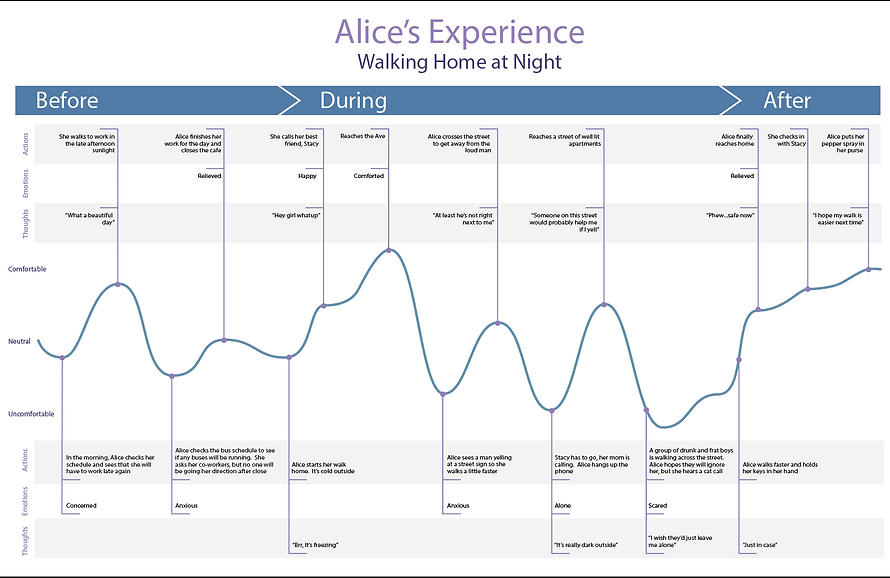
User Journey Map
Our user journey map presents the experience of our persona, Alice, on a typical walk home. We captured touch points between Alice and her environment and identified how those interactions affected her actions, emotions, and thoughts during her walk. We chose to track her comfort level throughout the walk because it was the emotion that came up most frequently in user interviews. Every other emotion that we came up with played into how comfortable a person felt during their experience.
Design Requirements
Our design specifications were based off the experiences our group came to understand through interviews, personas, and user journey maps. We wanted to create a solution that helped users:
-
Reassure friends and family of their safety throughout the walk or upon arriving home safely
-
Create a sense of community commitment to safety
-
Find the safest way home using publicly available data as well as data collected through the platform
-
Be empowered to manage their own safety by making informed decisions
-
Handle a wide variety of situations, including a typical walk home and an emergency situation
Storyboards
Each member of our team created two scenarios, one sketched and one using real photographs, to depict their solutions to the specific scenario. We based the scenarios we chose off of our personas and user journey map in order to get a realistic understanding of our target users.
These storyboards solidified our ideas to create a mobile application with optional smartwatch extension because our users always have their phones on them and a smartwatch extension would allow users to contact authorities in a quick and discreet way if need be.

Information Architecture
After finalizing that we wanted to create a mobile application with an optional smartwatch extension, we created an information architecture to help understand the flow of our application and how each feature would fit together.
Paper Prototyping
Based on our information architecture and storyboards, we set up our three key paths and built our initial paper prototypes on index cards. The three key paths included the initial set up, a normal walk, and an emergency situation.

Paper prototype screens showing interactions in our key path scenarios
Usability Testing
We used our paper prototype to conduct usability testing with four target users. This study sought to evaluate the usability of our application LightHouse, using a low-fidelity paper prototype to test three basic features with potential users: the initial set up, a normal walk home, and an emergency encounter. Observations from this study informed a series of improvements to our original design.
Findings
By observing users completing our three key task scenarios, we came to several conclusions about user behavior. The most important things we found in our usability testing were that users:
-
Do not read even small amounts of text
-
Reflexively enter a security pin when given the option, even if they are not safe
-
Value the ability to contact their friends and family and wish they were able to do so throughout the walk
-
Are more likely to use the smartwatch extension than the button on the phone screen
-
Value the ability to choose their route based on available data
These observations led us to make several changes to our mobile application, including re-prioritizing the desire to stay connected with friends and family, redesigning the panic button response, eliminating redundant setup screens, and leaning on visual cues instead of text throughout the design.
Wireframes
The understanding of our users that we developed through research, as well as feedback on our prototype from usability testing helped us develop our full system. The annotated wireframes gives an overview of the purpose and functionality of our solution. We described the functionality of certain features within our system and created a visual interface state transition diagram that demonstrates one key path scenario.
High-Fidelity Mock Ups
The high-fidelity mockup is the last step of the process that brings together our work throughout the quarter in a complete, professional, and visually pleasing manner. Our design decisions were informed by an understanding of the intended users, and feedback on wireframes and high-fidelity drafts to shape our final screens. It represents the final iteration of our design and effectively addresses our users’ needs.
Reflection
This was the first time that I went through the whole user-centered design process from start to finish. It was important to me during the design process that we made sure that our solution was easy to use and simple enough to be used in a situation when you may be reacting instinctively out of fear. Through this project, I found that visual design was not my strong suit but I enjoyed learning from my peers in this aspect. I learned a lot of new skills through this project like creating personas, user journey maps, and information architecture. I'm excited to use these skills that I've gained into future projects!